GRAPHICS DESK INTERN, JUN - AUG 2013
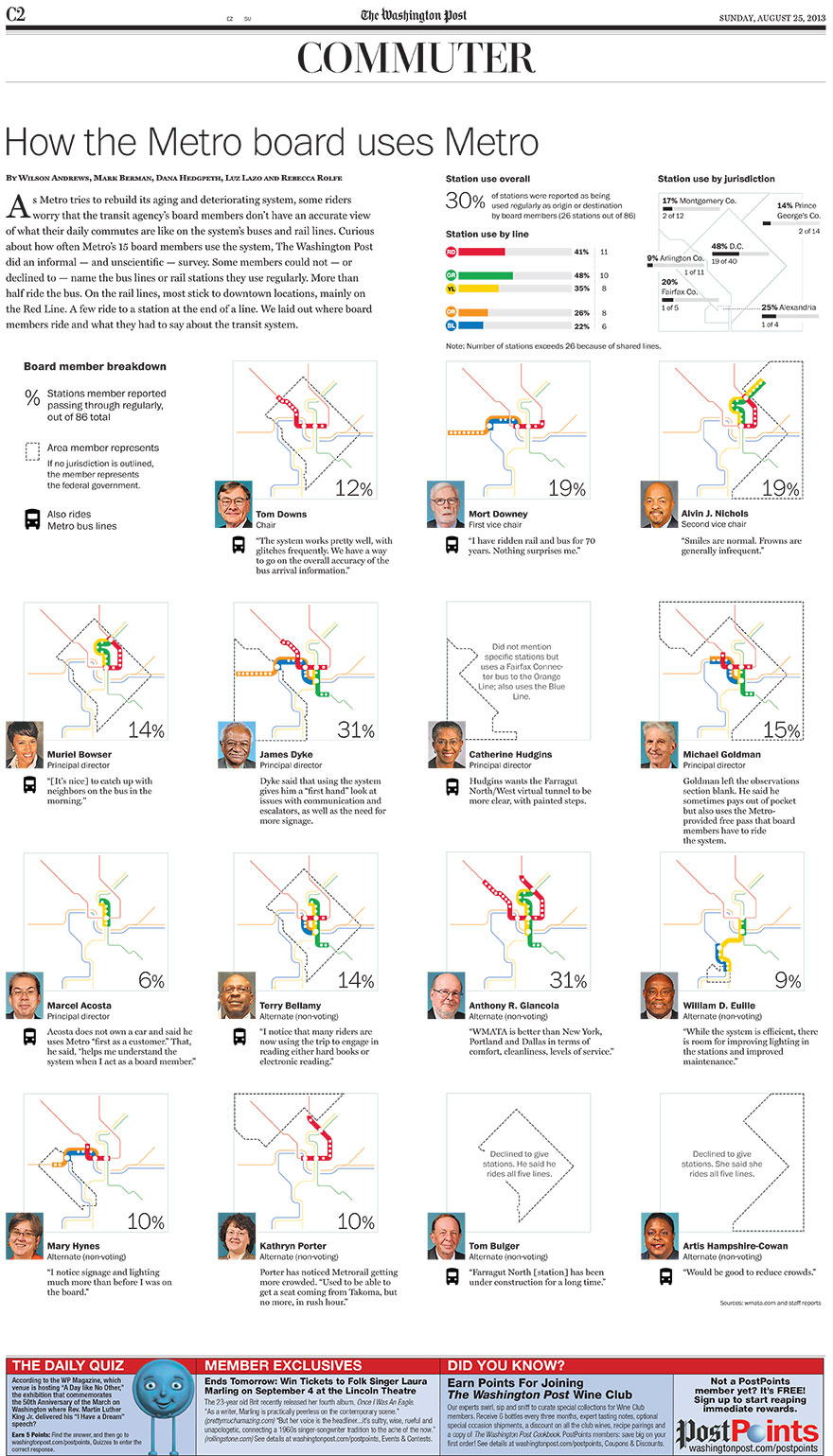
I spent a summer with the top-notch Post graphics desk. My hat's off to them and their incredible work.
On my last day I stayed late to work on this full-page spread to illustrate how various Washington Metro Board members weren't regular riders of the metro. Small multiples display is a useful format for print that really shines with the broadsheet size.
D.C. census graphic
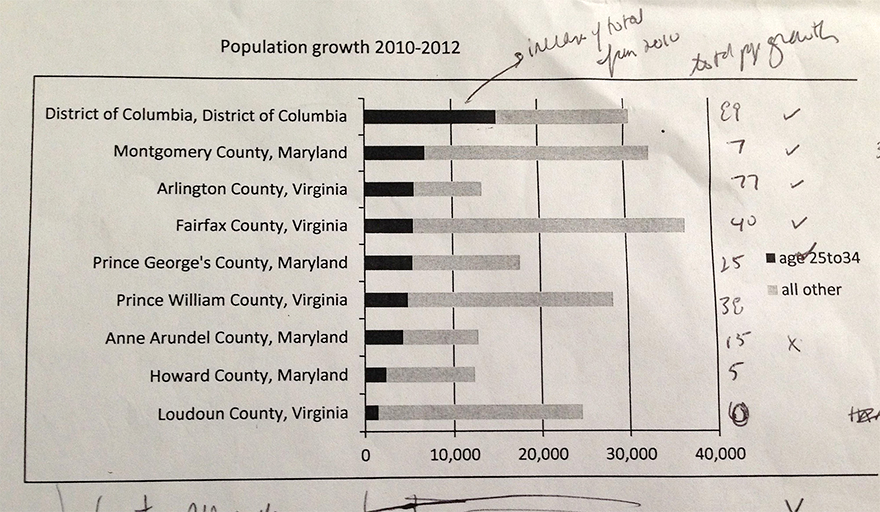
For a story on young people moving to DC, I could always fall back on a basic bar chart, but I decided to explore other ways to visualize it. As a story about movement, it needed something special. I tried out a few versions (below.)
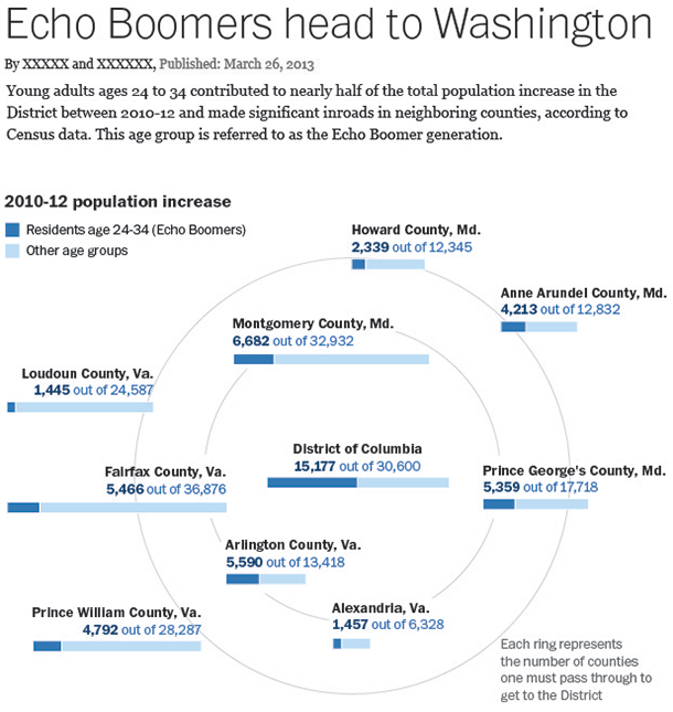
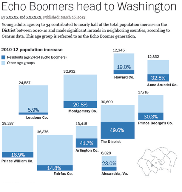
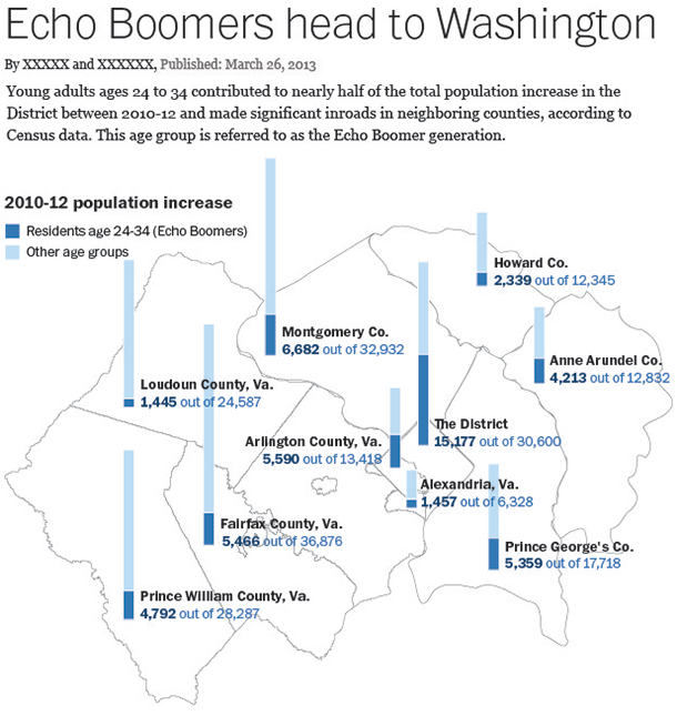
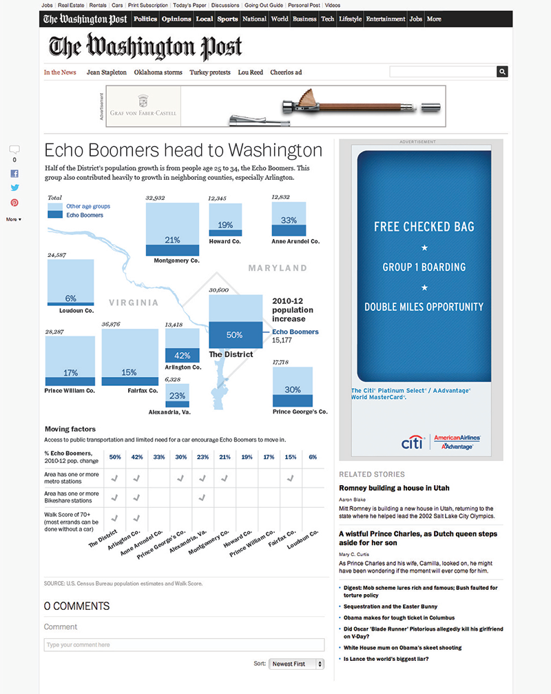
The published graphic conveyed both numerical and geographical data.
As a bonus, my editor appreciated a creative spin on a story other news organizations were covering in a more conventional way.
